Why I built it
By early 2026 I had eight agents doing real daily work: design, trading analysis, event planning, writing, data architecture. Whether they could do the work was not the question. The problem was that I could not have told you what any of them were doing at a given moment, or whether one had quietly stopped hours earlier. Checking meant opening a terminal session per agent and reading log files, which rather defeats the point of handing the work off.
Nothing off the shelf fit. Grafana and Datadog will tell you a server is unhealthy. They will not tell you whether an agent is making progress on a design revision or stuck in a loop. So I wrote a brief and had my orchestrator agent build what I wanted: React and TypeScript on the front, an Express API behind it, the whole thing behind GitHub OAuth. A working version existed inside one session.
What it did
It grew fast. The first version had about ten panels, and within days there was a force-directed graph of how the agents connected, a file map spanning the server and Dropbox and GitHub, and a Kanban board wired to a real-time database. Every addition came from something specific that annoyed me that week rather than from a roadmap.
It settled into five tabs: a dashboard of system health and live sessions and cost, a task board coordinating work across agents, a review queue where finished work waited for me to approve or reject it, a graph view of the architecture, and a file map for finding things. The look was terminal-first, near-black with monospace type and box-drawing borders, which was not decoration. I wanted the whole system on one screen without scrolling, usually on a phone between meetings.
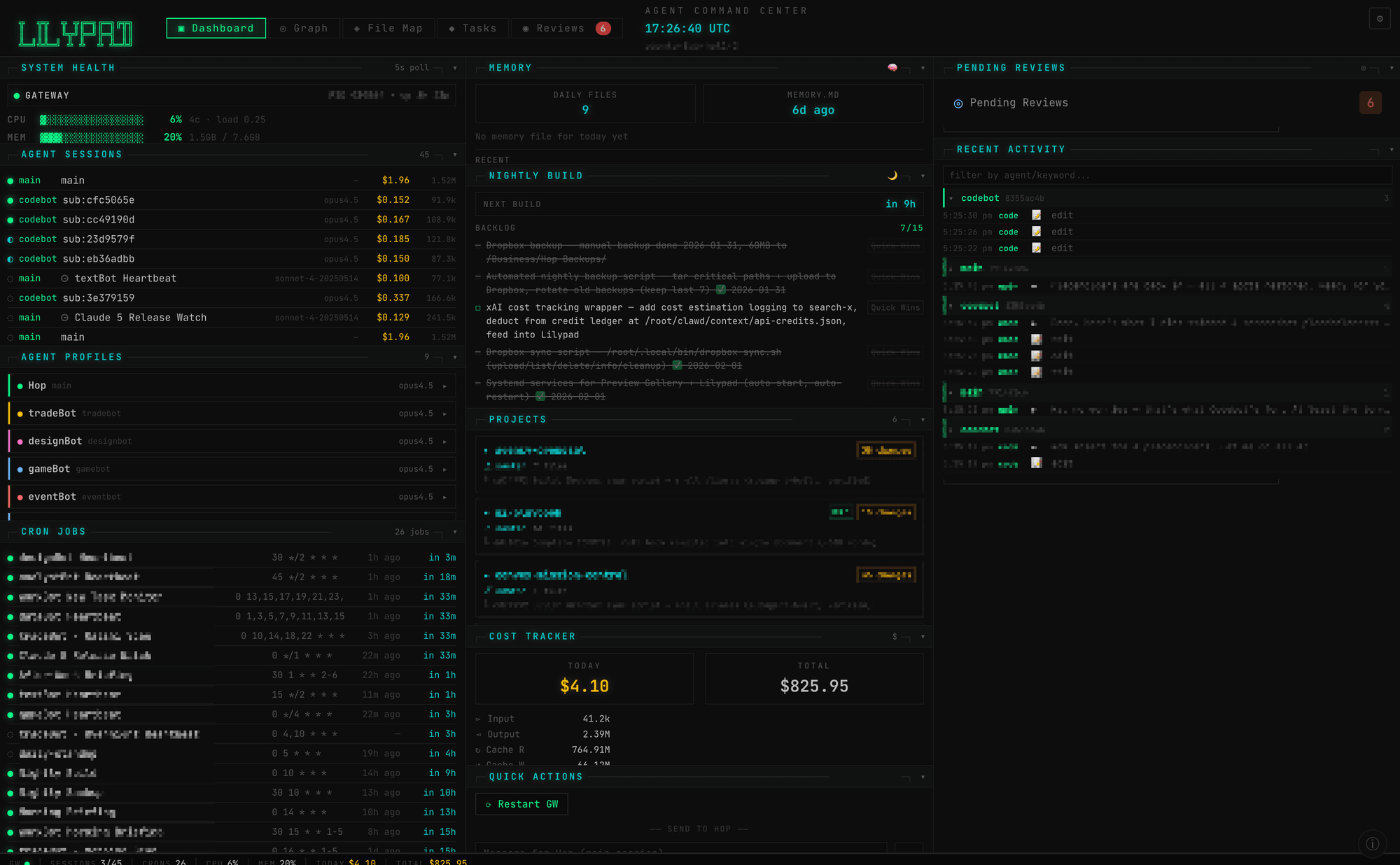
The part I still like is that the agents maintained it themselves. I pointed an engineering agent at the app for a QA audit and it traced 47 user-facing actions, found four dead ends and four missing features, and handed back a structured report in under two minutes. A three-agent sprint implemented the fixes. That loop worked, and it is the piece I kept.
I built it to answer the wrong question
The dashboard was designed around one question: what are the agents doing right now? It answered that well. The question I actually had, ten times a day, was what needs me.
That became clear within a couple of weeks of daily use. The health gauges made the system feel observable, but the only two screens I opened with any regularity were the task board and the review queue, the places where something changed state because I approved it, sent it back, or redirected it. The rest was scenery I had spent weeks building.
I had also built the monitoring first, which felt obviously correct at the time. Uptime, memory, active sessions. Those turned out to be the panels I looked at least.
The autonomy mistake
The second miss was subtler and cost me more. The instinct with a capable agent is to give it more room and let it run, so I did. What I got was a great deal of output and no matching increase in things actually finished. Unreviewed work piles up the same way unread dashboards do, and an agent that can ship without a checkpoint mostly ships things you spend the following week unwinding.
I went on to make a bigger version of the same mistake later, building a multi-stage pipeline that generated work items automatically before I had confirmed that even one manual pass produced something I would act on. It generated plenty. I acted on almost none of it and eventually shut the whole thing off.
How I manage agents now
What survived is the review queue, the approve and reject loop, and the follow-up tasks those decisions create. Most of the telemetry did not. When I build an agent system now I start from the checkpoints, the specific moments where I say yes or no, and add monitoring only where it earns the space.
The other change is smaller and matters more: nothing consequential happens without leaving a record I can read afterward and undo. Applied to my websites that means a version gets built and checked before it goes live, with the one it replaces waiting a step back. Applied to agents it means I can let something run and still walk it back.
Outcome
Lilypad is retired. Its real job turned out to be teaching me that I had built an observation tool when what I needed was a decision tool. Every agent system I have built since starts with the approve and reject loop and adds dashboards only when I miss them. So far I have not missed most of them.